Photo composition is the art of arranging elements within a photograph to create a visually appealing and impactful image; it’s how photographers use techniques of visual storytelling to guide the viewer’s eye, convey a message, and evoke emotion. At dfphoto.net, we believe mastering photographic composition is crucial for taking your images from snapshots to works of art. This detailed guide will explore every aspect of composition, from fundamental concepts to advanced techniques, empowering you to create captivating photographs. Whether you’re an amateur or a seasoned pro, this resource will provide fresh insights and practical tips. Delve into visual storytelling, point of interest, and breathing space that will transform your photography.
1. Why Is Composition Important in Photography?
Imagine a symphony orchestra where the musicians play their instruments randomly. It would sound chaotic and unpleasant. Similarly, a photograph without a deliberate composition can feel disjointed and fail to capture the viewer’s attention. Effective composition transforms a collection of elements into a harmonious and engaging visual experience.
- Harmony: Proper element layout creates a sense of balance and visual appeal.
- Storytelling: Composition communicates a narrative, guiding the viewer through the image.
- Engagement: A well-composed photo encourages the viewer to explore the scene and stay engaged.
- Impact: Composition amplifies the message and emotion of the photograph.
In essence, photography composition is the language that elevates a simple picture into a compelling visual story.
2. Painting vs. Photography Composition: Key Differences
Both painting and photography share the goal of creating visual art, but their processes differ significantly. Painters have weeks or even months to meticulously plan and execute their compositions, carefully adjusting every element. Photographers often work under time constraints, especially in genres like landscape, street, and sports photography. Landscape photographers must rapidly assess and capture the scene as the light changes. Street and sports photographers sometimes have only a split second to make compositional decisions.
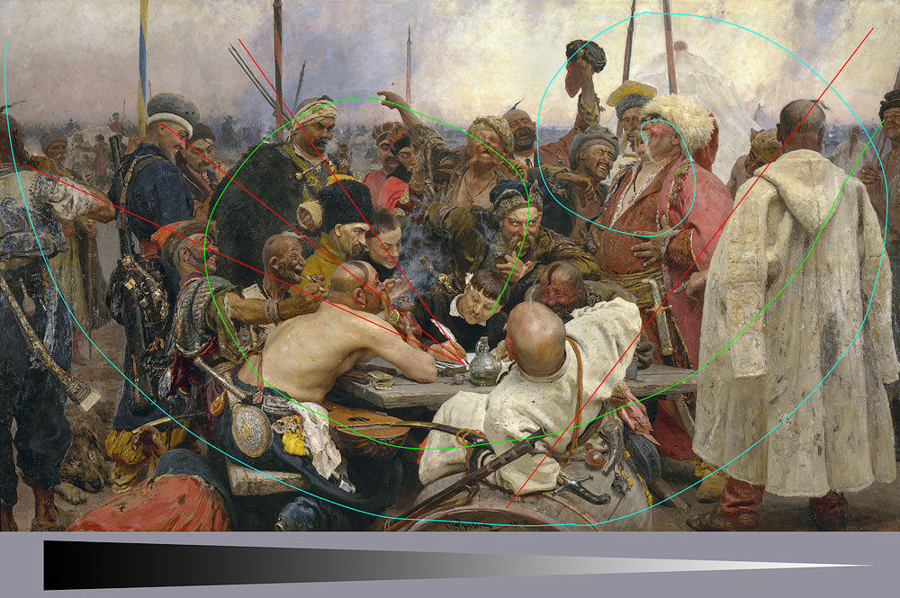 Ilya Repin Zaporozhian Cossacks – A masterful example of painting composition, showcasing diagonals, spirals, and tonal transitions.
Caption: Ilya Repin’s “Zaporozhian Cossacks” exemplifies painting composition with diagonals, spirals, and tonal shifts.
According to research from the Santa Fe University of Art and Design’s Photography Department, in July 2025, while photographers have less time to decide on the final look of an image compared to painters, understanding compositional principles is essential for quickly making effective choices in the field. Because of these constraints, it is often beneficial to take a few extra shots to ensure all aspects of the scene are captured effectively.
3. What Are the Core Concepts and Principles of Photo Composition?
Before diving into specific techniques, it’s essential to understand the foundational concepts and principles that govern photography composition.
3.1. How Does Frame Shape Impact Composition?
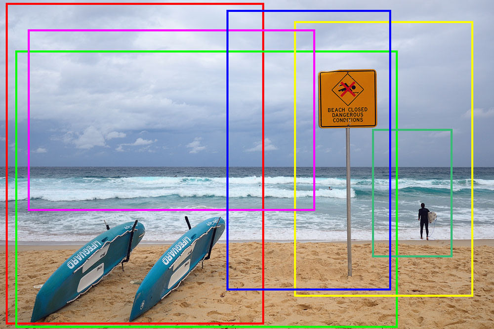
The frame shape is the initial element influencing a photograph’s perception. Historically, the rectangular frame is common, and the aspect ratio is crucial. A 3:2 ratio, derived from the 36 x 24mm sensor size (originally film size), is prevalent. While a horizontal frame aligns with natural human vision due to eye placement, a 4:3 ratio may seem more intuitive. A 2:3 ratio can benefit portraits by accentuating body elongation.
 Various frame shapes showcasing different aspect ratios and their impact on composition.
The square frame is notably challenging due to its inherent stability and lack of dynamics. To effectively use a square format, ensure the subject is stable or lacks any dynamics, such as symmetrical patterns.
3.2. Vertical vs. Horizontal Alignment: Which Is Best?
Typically, choose a horizontal frame when the majority of compositional lines are horizontal, and vice versa. For increased tension, consider the opposite approach. For instance, including a vertical subject in a horizontal frame requires ample breathing space around it.
3.3. Why Is Filling the Frame Important?
The filling principle means every part of the frame should enhance the story and image. Arrange elements so the photo is neither crowded nor empty. Use the entire available area, ensuring that cropping any part of the photo does not improve its harmony.
 A landscape photo showcasing how filling the frame with a balanced composition can create a more engaging image.
Avoid placing bright, dark, or high-contrast elements near the edges, as they attract undue attention. Similarly, placing vertical lines near vertical edges or horizontal lines near horizontal sides can be distracting.
3.4. What Is Visual Storytelling in Photography?
Storytelling is the essence of photography. A photograph should communicate something about the subject or the story it conveys. Without a narrative, it remains a mere snapshot. This guide explores various means of visual storytelling. Much like a book, a photograph needs a subject, context, and layout, forming the visual narrative. Composition, therefore, becomes a storytelling tool.
 A series of cropped images demonstrating how changes in context alter the story being told.
Consider how cropping affects the story a photograph tells, where the context provides the narrative.
3.5. What Makes a Strong Point of Interest?
A photo should have a clear point of interest: the main subject or hero. This could be an object like a tree, a mood, or a feeling that inspired the shot. Build the story around this subject, whether it’s a person, animal, emotion, relationship, color, pattern, or rhythm.
 A photo highlighting the relationship between dead and alive vegetation as a point of interest.
3.6. Why Is Breathing Space Crucial?
Breathing space refers to the area around the main subject, preventing it from appearing visually suffocated. An object too close to the frame’s edge disrupts the viewer’s eye movement, breaking the viewing experience. Adjusting the amount of breathing space can create specific effects.
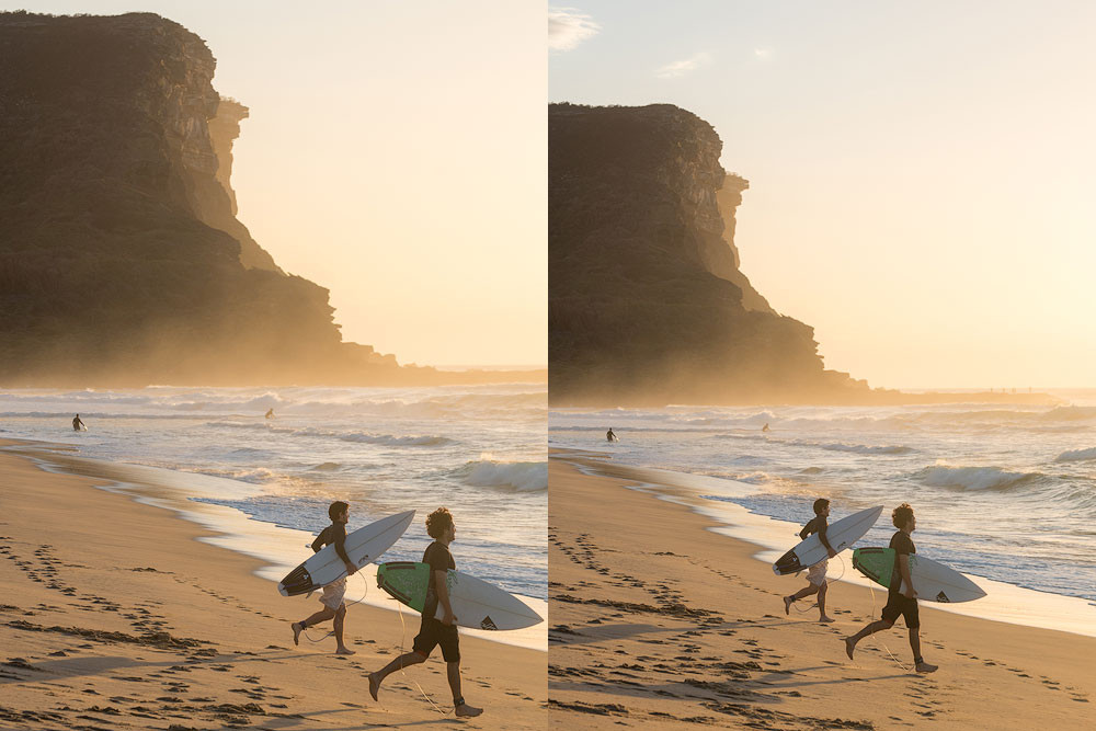 Two images showing the effect of breathing space on composition, where one image feels airier and suggests movement.
3.7. How Important Is Checking the Corners?
Similar to positioning high-contrast objects near frame edges, corners are critical. Before taking a shot, check the corners and eliminate anything distracting to maintain simplicity and clarity. Objects near corners draw significant attention, causing the eye to jump back to them.
 Two images demonstrating how checking the corners for distracting elements can improve clarity in an image.
3.8. Why Should You Always Check the Background?
Always check the background to ensure the main subject stands out without distractions. Avoid branches sticking out of the head or elements blending with the main point of interest.
3.9. Why Should You Simplify Your Composition?
If an element doesn’t contribute to the story, remove it. Aim for clarity by including as little as possible. Subtraction involves eliminating anything unimportant, distracting, or competing with the main subject.
Our eyes filter out many elements automatically; however, in visual arts, you must remove everything that hinders the viewer from grasping the concept quickly.
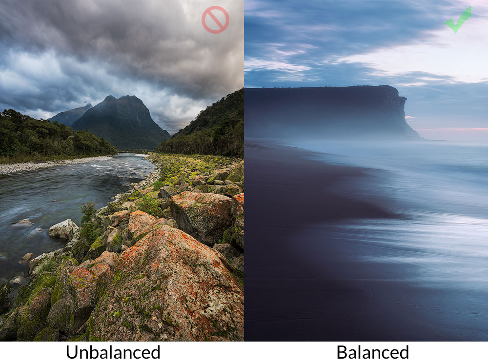
3.10. Understanding Balance in Composition
Composition balance is complex; while balanced shots are often preferred, imbalanced compositions can intentionally create tension and expressiveness. Determine if a photo is balanced or leans to one side. “Heavy” elements include dark, bright, high-contrast areas and saturated zones. A dark mountain peak can be balanced by a brightly colored cloud, considering the element’s significance and proximity to the center.
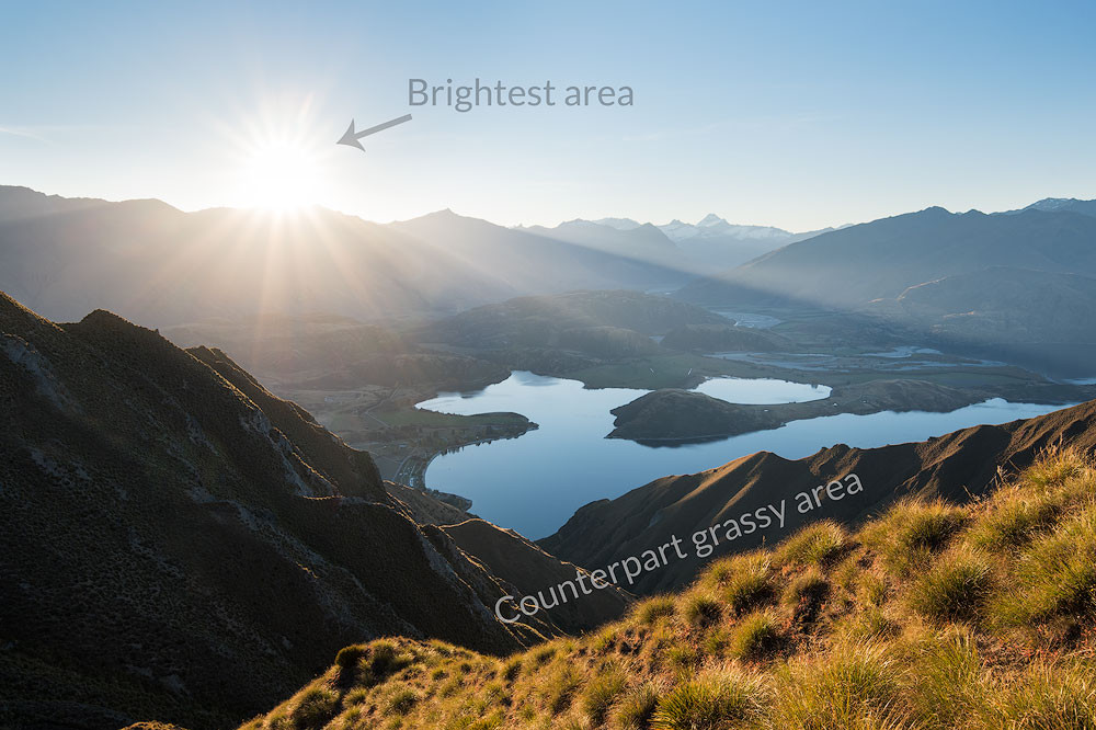 An image illustrating the concept of balance in photography composition, showing how a bright sun can be balanced by a larger bright zone.
The visual weight increases as an element moves away from the center. Balance is not opposite dynamism but contrary to off-balance, providing different influences on the viewer.
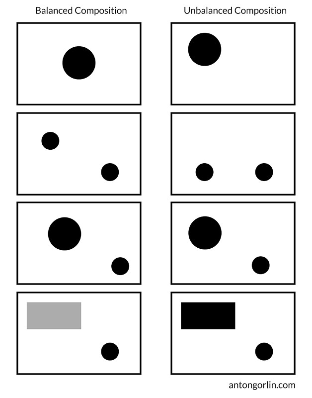 Examples of balanced and unbalanced compositions.
The larger the object in the scene, the harder it is to balance. A massive rock in the foreground can overwhelm the photo, indicating that balance also applies to the object-to-scene relation.
 Images showing a balanced and unbalanced shot based on the visual weight of elements.
Intentional off-balance can heighten a sense of danger and scale.
 An intentional off-balance photo increasing the sense of danger and scale.
3.10.1. Static Balance
Static balance features identical or similar objects at equal distances from the frame’s visual gravity center. A red cloud on one side and a robust dark tree on the other can create static balance.
 A photo illustrating static balance using a cloud and a counterpart swirl.
3.10.2. Dynamic Balance
Dynamic balance involves two objects of different sizes at varying distances from the center, creating balance through contrast.
 A photo illustrating dynamic balance using a dark wave and saturated sky.
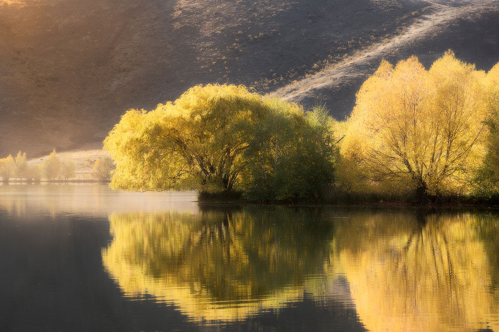
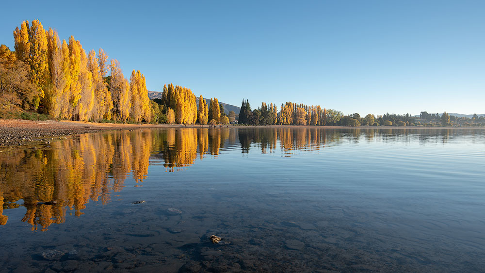
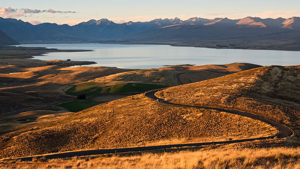
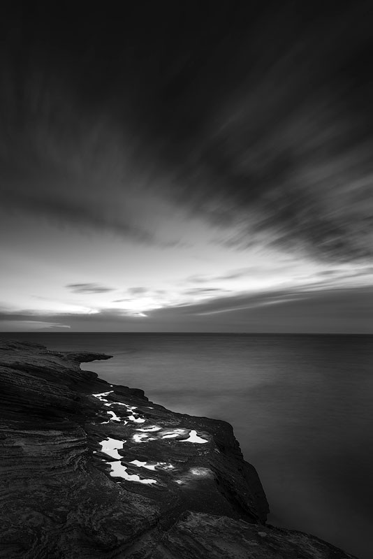
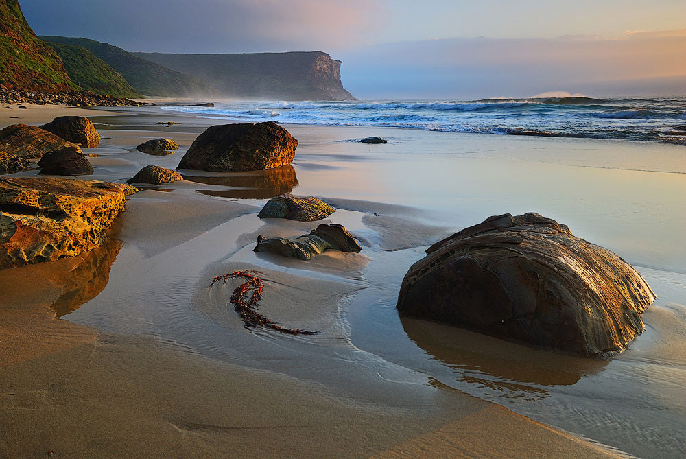
3.11. Foreground, Middle-ground, and Background: Creating Depth
Dividing a photograph into foreground, middle-ground, and background is fundamental for adding volume and dimensionality. This segregation transforms the 3-D world into a 2-D image, restoring depth.
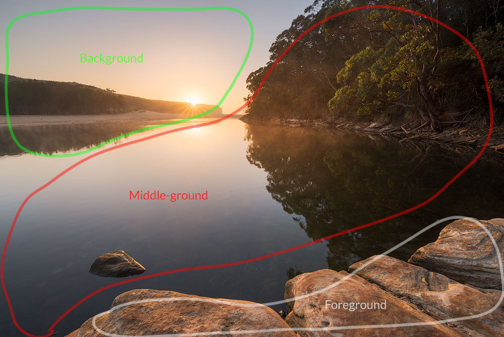 An image illustrating layers in landscape photography, showing foreground, middle-ground, and background.
Three layers allow the viewer to look deeper into the shot, while one layer can appear flat. Two layers may compete, but three create a smooth visual journey.
 A graphical landscape with two levels.
In seascapes, include distant cliffs and sky as a background, the sea as a middle ground, and rocks or the beach as a foreground. Alternatively, zoom in to feature a wave as a foreground object with minimal middle ground.
4. Composition Techniques: Practical Application
Having covered the core concepts, let’s explore specific techniques that can enhance your photographs. These methods might seem contradictory, but they provide varied approaches for different scenarios.
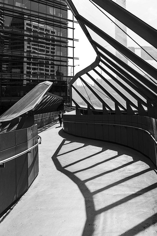
4.1. Leading Lines: Guiding the Viewer’s Eye
A leading line directs the viewer’s eye through the image, telling a story. This line can be solid, like a fence or cliff, or a broken line formed by separate objects. At least three objects are ideal for a prominent repetition.
 A photo illustrating leading lines in composition, where lines guide the viewer's eye through the scene.
Avoid splitting the frame with a line in two, especially a vertical line in the middle. Lines should remain within the photo, guiding the viewer without leading them out of the frame.
4.2. Tension and Stability: Using Lines Effectively
Lines parallel to the edges (vertical and horizontal) add stability, while diagonals and triangles add dynamism and tension. Our eyes naturally perceive horizontals and verticals, making diagonals feel dynamic and lively.
 A composition made of multiple triangles.
Use geometric shapes, especially triangles, for dynamic images. Vertical and horizontal lines add stability, while diagonals add dynamism. Adjust the composition based on the desired mood: calm or energetic.
 An image illustrating stability in composition, where the major lines are vertical, resulting in a more stable photo.
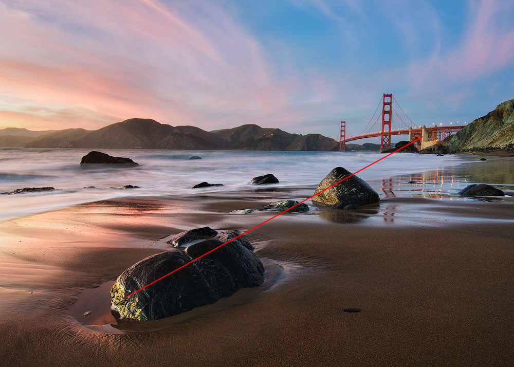
4.3. Diagonals: Creating Dynamic Compositions
Diagonals are easily created and add dynamism. A slight angle change transforms a horizontal line into a diagonal, guiding the viewer’s eye.
There are two main ways to place diagonals:
- From one corner to another.
- Using the Diagonal Method, with lines from each corner at 45 degrees, forming a rhombus.
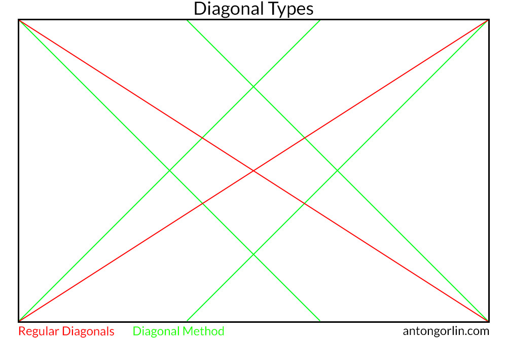 A diagram illustrating composition diagonals and how they can be used in an image.
4.4. Ascending/Descending Diagonal: Psychological Impact
The arrangement of elements affects perception. Most people scan images left to right, influencing how diagonals are interpreted. A slope can be shown as a challenge (ascending) or an easy descent (descending), impacting the viewer’s emotional response.
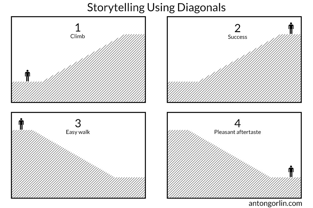 Diagrams illustrating how diagonals can be used for storytelling, such as showing someone climbing or descending a slope.
Here’s another take on the diagonal directions and their psychological meaning.
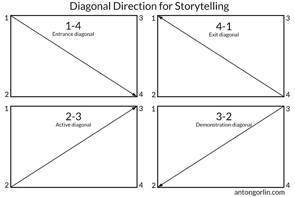 Diagonals direction for storytelling
1-4 – Entrance diagonal. Good for the main hero to enter the frame.
4-1 – Exit diagonal. Likewise, showing a train going into the distance.
2-3 – Active diagonal. A good layout for the struggle to overcome like an uphill battle or a mountain climb.
3-2 – Demonstration diagonal. Something is showing off, like a protest or a march.
Take these into account when putting together your composition.
4.5. Rule Of Thirds: A Beginner’s Staple
The Rule of Thirds involves dividing the frame into thirds, both horizontally and vertically, creating a grid. The main subject is placed at one of the intersections for smoother eye scanning. Important lines should align with grid lines.
 An image illustrating the rule of thirds, showing how to position elements at the intersections of the grid lines.
4.6. Golden Rectangle: Natural Proportions
Similar to the Rule of Thirds, the Golden Rectangle uses grid lines closer to the center, derived from natural proportions. This rule aligns with natural aesthetics, as many things are built around the golden ratio.
 An image illustrating the golden ratio in photography, showing how the grid lines are positioned according to the golden ratio.
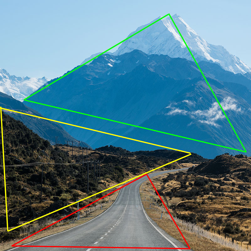
4.7. Golden Triangle: Creating Dynamic Divisions
The Golden Triangle involves drawing a diagonal from corner to corner, then drawing two lines from the remaining corners at 90 degrees to the main diagonal, forming four triangles. Objects should loosely resemble these lines.
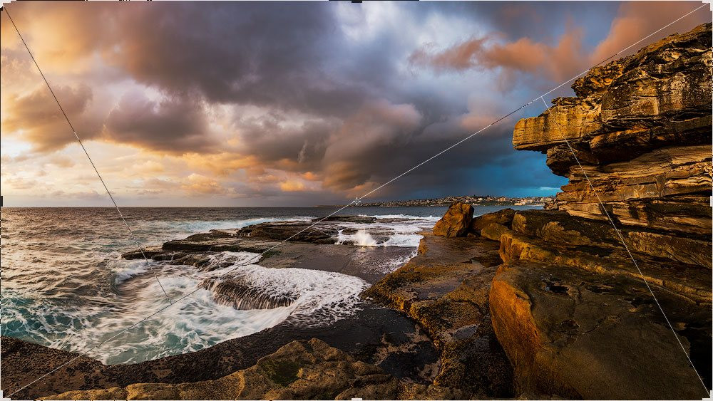 A photo illustrating the diagonal composition in seascape photography.
4.8. Golden Spiral: Natural Growth Patterns
The Golden Spiral is a self-repeating spiral shape with a constant growth ratio. Objects should roughly follow the spiral, with the main subject near the twisting point. Fibonacci numbers approximate the golden spiral.
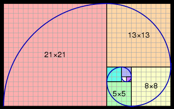 A diagram illustrating the Fibonacci spiral, a way to approximate the golden spiral.
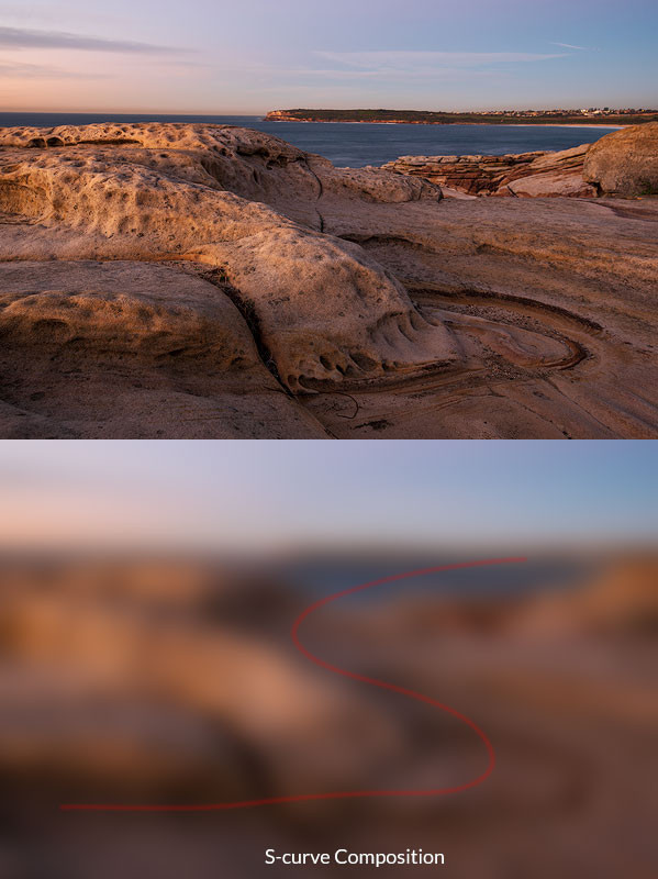
4.9. S-Shaped Curve: Gentle Eye Flow
The S-shaped curve is dynamic and pleasing, guiding the eye through the image to the main subject. Unlike a direct diagonal, the curve is gentle and natural.
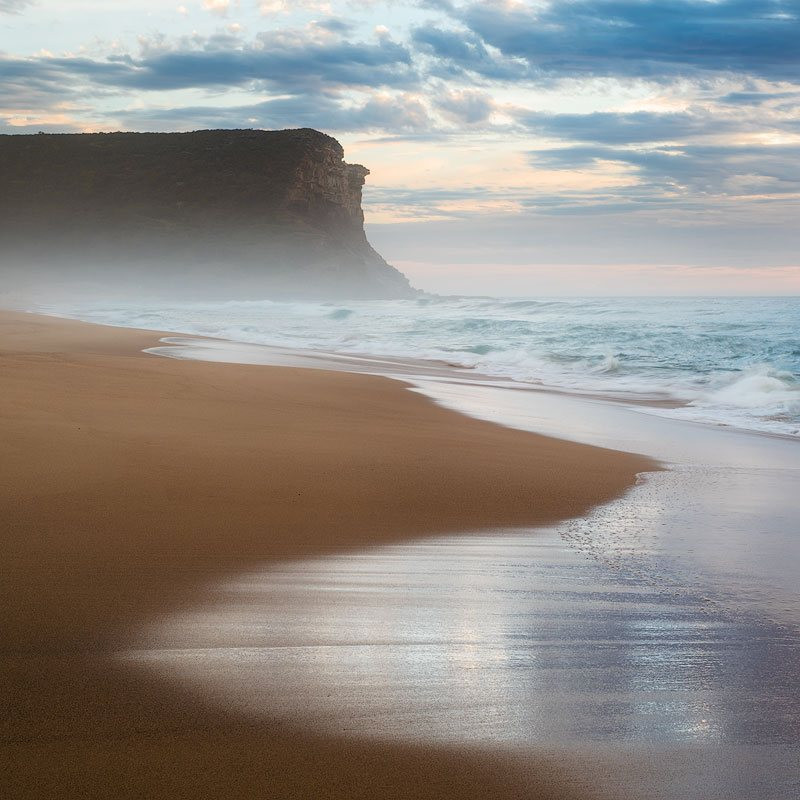 A photo illustrating an S-shape composition in a seascape, showing how the curve guides the viewer's eye.
4.10. Continuous Curved Lines: Keeping the Flow
Keep the whole line within the frame whenever possible. If the line goes beyond the frame, it loses its effectiveness.
 A photo illustrating a continuous curved leading line, showing how it keeps the viewer's eye within the frame.
4.11. Central Composition: When to Break the Rule
Contrary to common advice, central composition can be effective if the photo focuses solely on the subject, with everything else as complementary. Strong composition lines should point to the subject, which must be the center of gravity and have prominent symmetry.
 An image illustrating central composition, where the main subject is placed in the center and is the focal point.
The horizon can be in the middle when:
- One part of the image is significantly stronger than the other.
- The horizon is not a signature line.
- There is symmetry.
 An image illustrating central composition with the horizon in the middle, where the horizon plays a secondary role.
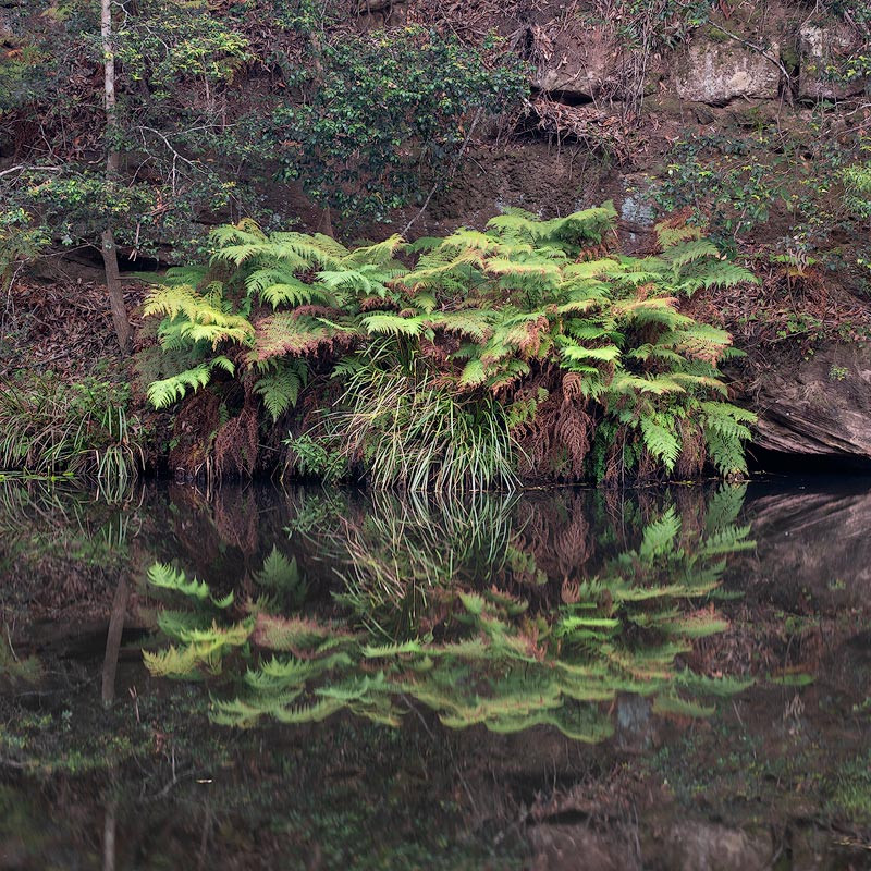
4.12. Symmetry: Balance and Harmony
Symmetry is closely related to balance and human perception. Look for it in architecture and reflections, as it creates a sense of harmony.
 A photo illustrating symmetry through reflections, showing how symmetry can create balance.
4.13. Resemblance: Spotting Similarities
Find resemblances between entirely different objects by noticing similar shapes and accentuating them with composition. The greater the difference between objects, the better the visual effect.
 A photo illustrating resemblance in framing, showing how similar shapes can create a visually interesting composition.
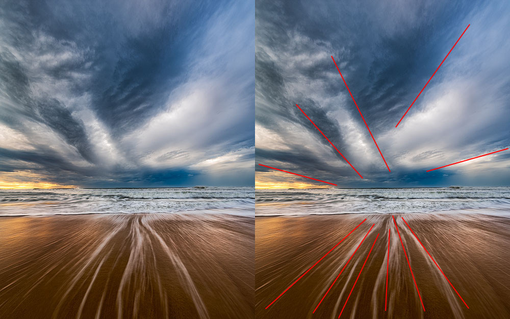
4.14. Radial Composition: Lines Pointing to the Center
Radial composition is a type of diagonal composition with many lines pointing towards the main subject. Avoid any other center of gravity to strengthen the effect.
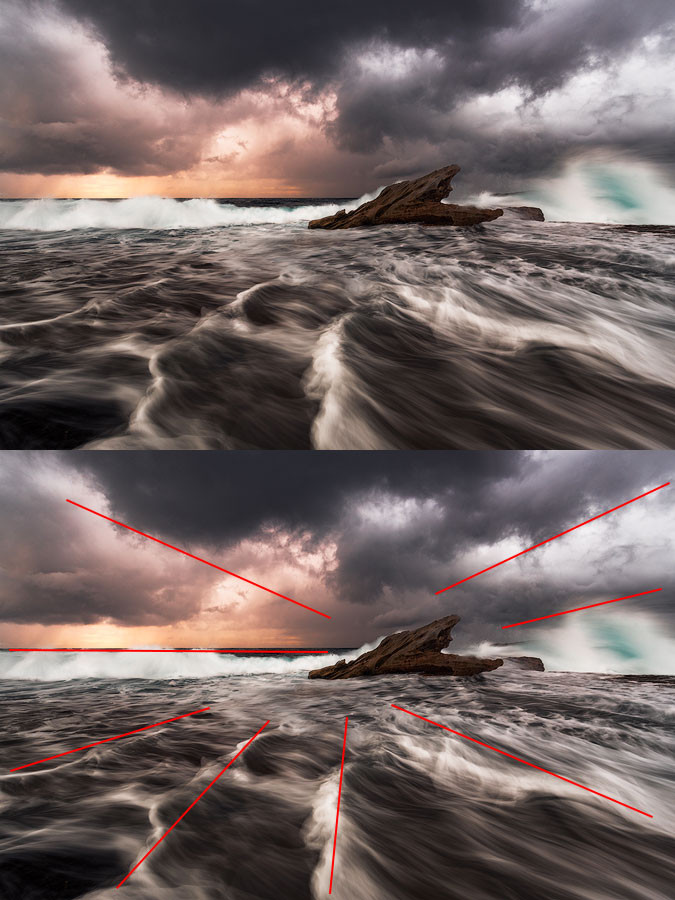 A photo illustrating radial composition in a landscape, showing lines converging towards a central point.
4.15. Negative Space: Emphasizing Emptiness
Deliberately leave empty space around the subject to emphasize loneliness, emptiness, or the smallness of humans, breaking the “fill the frame” principle tastefully.
 A photo illustrating negative space composition, where a large empty area emphasizes the subject.
4.16. Rule Of Odds: Uneven Numbers Are Appealing
Uneven numbers of objects are more appealing due to stability vs. dynamism. Two elements imply competition, while three convey a story and dynamic balance. Arrange elements into groups to apply this rule effectively.
 A photo illustrating the rule of odds in photography, showing how an uneven number of objects can create a more appealing composition.
This chart is only to give you a general idea of how it works and doesn’t give an exhaustible picture working in every case
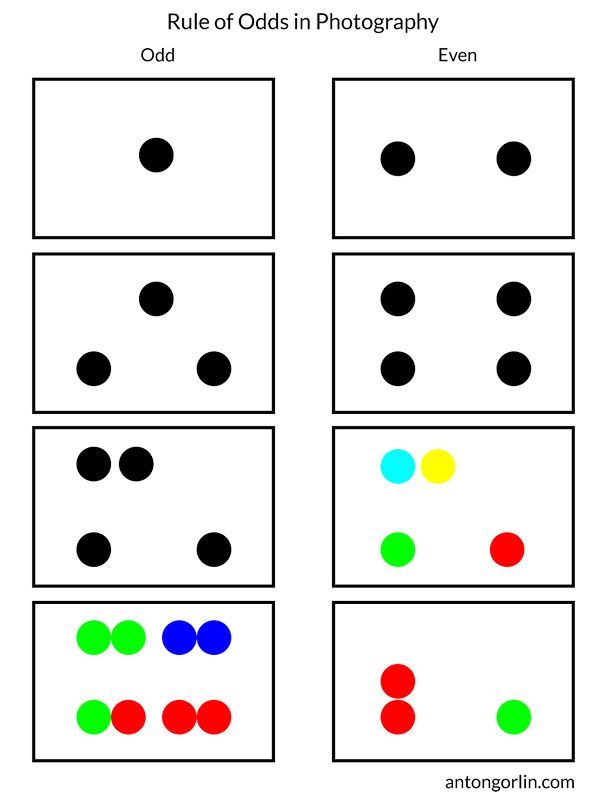 rule of odds composition
4.17. Block/Unblock Area: Creating Boundaries
Create closed (blocked) or open (unblocked) areas in the image. Open space allows flow into infinity, while closed areas keep us inside.
 A photo illustrating an open area in photography, showing a gap between cliffs that allows the eye to travel into infinity.
The wrong area type can ruin a shot. Open space is optimistic, while closed areas are stable.
 A photo illustrating a closed area, showing how the composition keeps the viewer inside the frame.
4.18. Contrast: Emphasizing Differences
Use contrast to create conflict between objects within a frame:
- Light (dark/light objects)
- Color (cold/warm)
- Psychological condition (happy/sad)
- Physical condition (relaxed/tense)
- Part-to-whole relation
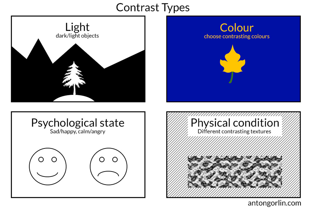 Diagrams illustrating contrast in composition, showing different types of contrast that can be used.
4.19. Subject Isolation: Making the Subject Stand Out
Isolate the subject using shallow depth of field or framing:
- Framing: Use elements to create a frame around the subject.
- Figure-To-Ground Relation: Use color contrast on the background.
 A photo illustrating framing composition, where elements in the foreground create a frame around the main subject.
Figure to Ground Relation – Just how easy is it to see the white on black and the black on white?
 yin yang
To make the main subject stand out, we need to separate it from the background.
 A photo illustrating figure-to-ground relation, where the subject stands out due to the background.
4.20. Repetition: Creating Patterns
Repetition involves repeating the same elements to create patterns, guiding the eyes and providing rest.
 A photo illustrating repetition in composition, where elements are repeated to create a pattern.
4.21. Rhythm: Recurring Patterns
Rhythm is a recurring pattern of elements differentiating by strong or weak conditions. You can build multiple rhythms in a single shot.
 A photo illustrating rhythm in landscape photography, showing patterns that encourage eye movement.
How many rhythms do you see here?
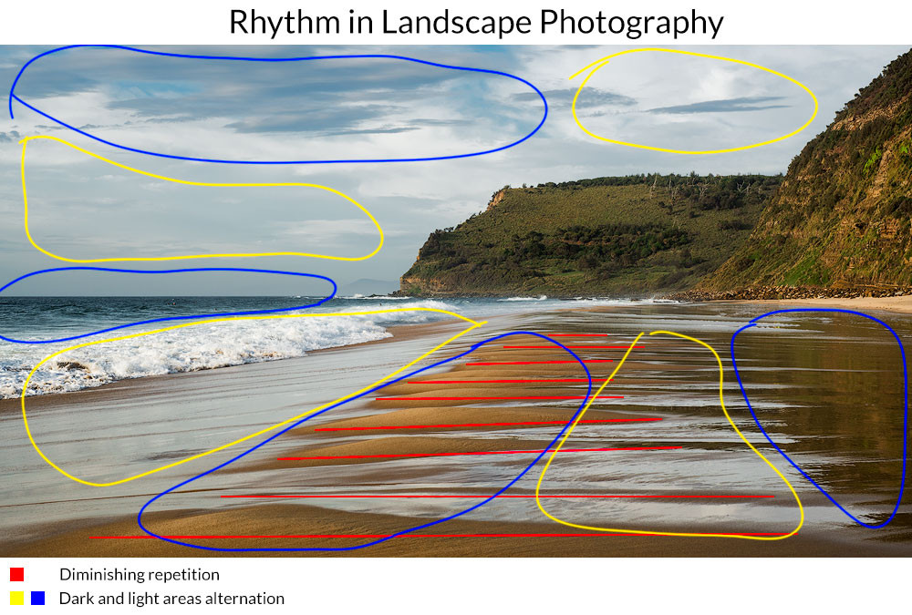 A photo illustrating rhythm in landscape photography-explanation
You can build a rhythm around the lines, objects, groups of objects, colours, tones, flares, light and dark areas, etc.
4.22. Breaking the Rhythm: Drawing Attention
Break the rhythm to accentuate a subject or draw attention to an imperfection, making the viewer take a closer look.
 A photo illustrating how to break the rhythm to draw attention to a particular element.
4.23. Depth Of Field: Focusing Attention
Depth of field affects what is in focus, making it the most important part of the photo, while the blurred part adds context.
 A photo illustrating depth of field in landscape photography.
4.24. Linear Perspective: Creating Depth with Lines
Converging lines create linear perspective, making the picture appear three-dimensional.
 A photo illustrating linear perspective, showing converging lines that create depth.
4.25. Tonal and Aerial Perspective: Using Atmosphere
Atmospheric conditions affect distant objects more than closer ones, creating tonal and aerial perspective:
- Clarity decreases with depth.
- Saturation decreases and colors whiten.
- Contrast fades and softens.
- Distant objects appear lighter.
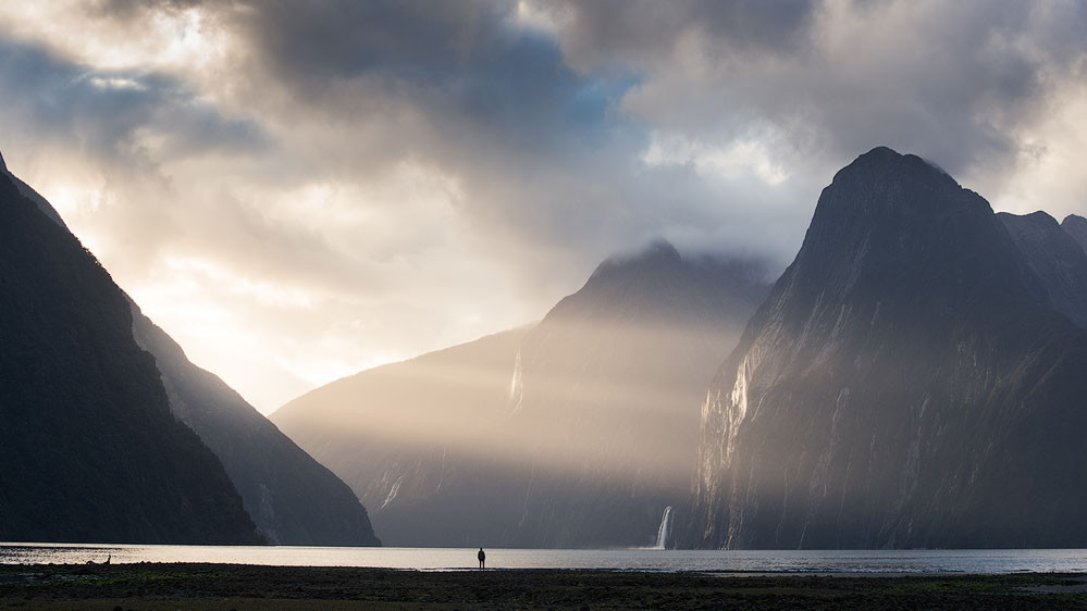
Aerial perspective is best revealed with backlight, while tonal perspective is achieved using tones or colors.
 A photo illustrating aerial perspective in a landscape, showing how distant objects appear less clear.
The front light is the worst. First of all, it renders any haze much weaker, often making it disappear altogether hurting the perspective. Second, it fills all the shadows making the shot look flat like a kid’s drawing.
 tonal perspective landscape
Here’s a table showcasing how to manipulate perspective.
| How To Strengthen Perspective | How To Weaken Perspective |
|---|---|
| Choose a point of view with distance visible | Choose a low viewpoint so that there is no middle-ground and the planes are disconnected |
| Use a wide-angle lens with a prominent foreground object | Use a telephoto lens from the distance |
| Use side light | Use front light |
| Include haze or fog in the distance, decrease saturation with depth | Equalise tones across the image, use UV filter to get rid of haze. Overdo Clarity slider. |
| Brighten image with depth, i.e., make the foreground dark, middle-ground brighter, the background even brighter | Equalise brightness across the image. |
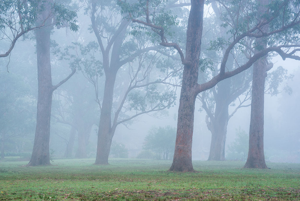
4.26. Patterns: Repetition Without Direction
Patterns are based on repetition but do not encourage eye movement in a particular direction. They add geometry and continuation.
 A photo illustrating a pattern in nature, showing repetitive elements that create a visually appealing texture.
4.26.1. Break The Pattern
Accentuate an object by breaking the pattern, using a different color, size, or alignment.
5. Photography Composition Building Blocks: Elements to Use
Composition can be built from various elements.
5.1. Solid Lines: Obvious Composition Elements
Use walls, rocks, cracks, or trees as solid lines. Due to perspective, parallel lines converge at infinity, forming diagonals.
 A photo illustrating solid line composition, showing how a solid line can guide the viewer's eye.
5.2. Suggested And Broken Lines: Implied Connections
Utilize suggested or broken lines by imagining lines between objects. Two objects suggest a line, and three suggest a curve or triangle.
 A photo illustrating broken line composition, showing how separate objects can suggest a line.
5.3. Direction Using Sight/Movement: Guiding the Viewer
Eyesight or movement creates strong composition lines, connecting planes or forming diagonals. Give enough breathing space for the direction of the eyesight.
 A photo illustrating composing using sight, where the line of sight creates a diagonal.
5.4. Visual Masses: Importance and Prominence
Balance elements using visual masses, based on prominence and visual strength:
- Color saturation: Saturated areas carry more weight.
- Contrast: Black on white stands out.
- Solid objects: Bigger objects have more significance.
 A photo illustrating visual mass balance, showing how bright water balances out a dark cliff and beach.
5.5. Shadows: Adding Intrigue
Shadows, especially long shadows, add visual weight and intrigue.
 A photo illustrating shadows in composition, showing how shadows can create strong lines and add depth.
5.6. Сolors: Creating Accents
Use colored areas, with saturated areas being stronger than less saturated ones. De-saturate all colors except the main ones to create a logical accent.
 saturated area composition building block
5.7. Brightness and Contrast: Emphasizing Areas
High contrast areas, both bright and dark, attract attention.
 A black and white landscape showing contrast
5.8. Faces and Figures: Psychological Weight
Faces carry psychological weight, extending to figures, both human and non-human. Living shapes bring more visual weight than non-living ones.
5.9. Textures and Patterns: Pleasing for the Eye
Textures and patterns are great for the foreground, creating pleasing areas and keeping the viewer engaged.
 A landscape showing a pattern in the foreground
6. How to Control and Affect Composition: Key Parameters
Certain parameters significantly affect composition.
6.1. Focal Length: Visual Effect
Focal length is crucial. Different focal lengths have different visual effects:
| Ultra-wide | 0-24 mm |
| Wide | 24-35 mm |
| Normal | 40-58 mm |
| Telephoto | 60 mm + |
- Wide-angle: Stretches the foreground, used for vastness and scale.
- Telephoto: Squeezes perspective, making objects seem closer.
- Normal: Offers versatile compositions.
6.2. Add a Hero: Scale and Relation
Adding a hero (human or animal) conveys a story, brings a sense of scale, and emphasizes figure-to-ground relation.
 A landscape showing a hero
6.3. Long Exposure: Changing the Structure
Long exposure smooths clouds, flattens seas, and blurs motion, changing the shot’s structure.
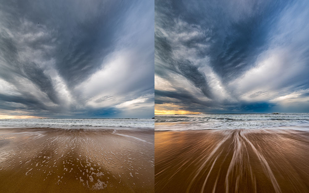 Comparison of long exposures
6.4. Point Of View Height: Changing Shapes
The point of view affects composition and object shapes. Lower positions detach layers and enhance expressiveness. Higher positions stretch everything and create a harmonious picture.
How point of view height affects your composition: Psychologically, the towering object seems larger and more prominent.
6.5. Light Direction and Quality: Crucial Factor
Light is crucial, especially its direction:
- Side light: Reveals texture, produces light and shadow, and adds volume.
- Backlight: Creates glowing effects and highlights tonal contrast.
- Front light: Makes the shot flat.
 side light photography
The backlight has different properties. It’s harder to photograph than other types of light but it’s so rewarding.
 front light waves
7. Improving Composition In Editing: Tools and Techniques
7.1. How To Check Composition
Blur your photo heavily in your editing program. The significant lines, areas, shapes and colours should still be visible. All you composition blocks should stay and form the skeleton of your composition.
 blurred composition
7.2. Photoshop Crop Tool
Once you select a crop tool, there is another button on the tool strip at the top. It includes a range of grids for your composition. Select a different grid from the drop-down menu or by pressing O on the keyboard. Some overlays are not symmetrical and to change their orientation, please press Shift+O.
8. FAQ: Mastering Photo Composition
- What is the most important element of composition?
The most important element is a clear point of interest. It gives the viewer a focus and purpose within the image. - How can I improve my composition skills?
Practice regularly, analyze the work of other photographers, and consciously apply different composition techniques. - Is it okay to break composition rules?
Yes, but it’s essential to understand the rules first. Breaking them should be a deliberate choice to enhance the image. - What role does color play in composition?
Color can be used to create contrast, balance, and guide the viewer’s eye. It’s a powerful tool for enhancing composition. - How does depth of field affect composition?
Depth of field can be used to isolate subjects, create a sense of depth, and control what the viewer focuses on. - What is the rule of thirds?
The rule of thirds is a
